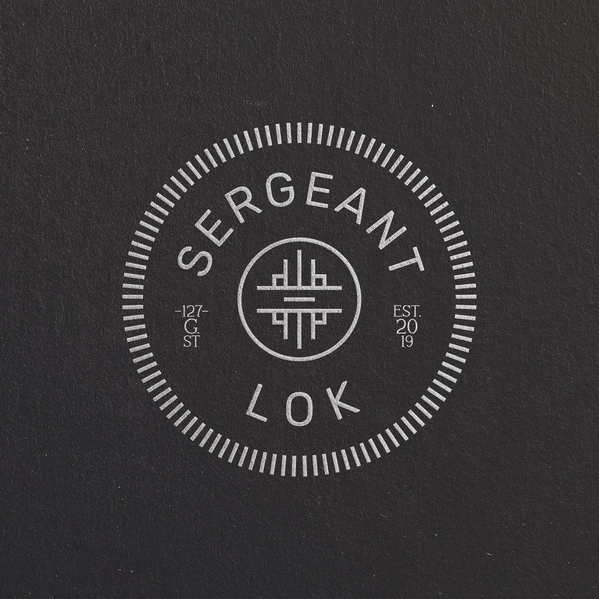
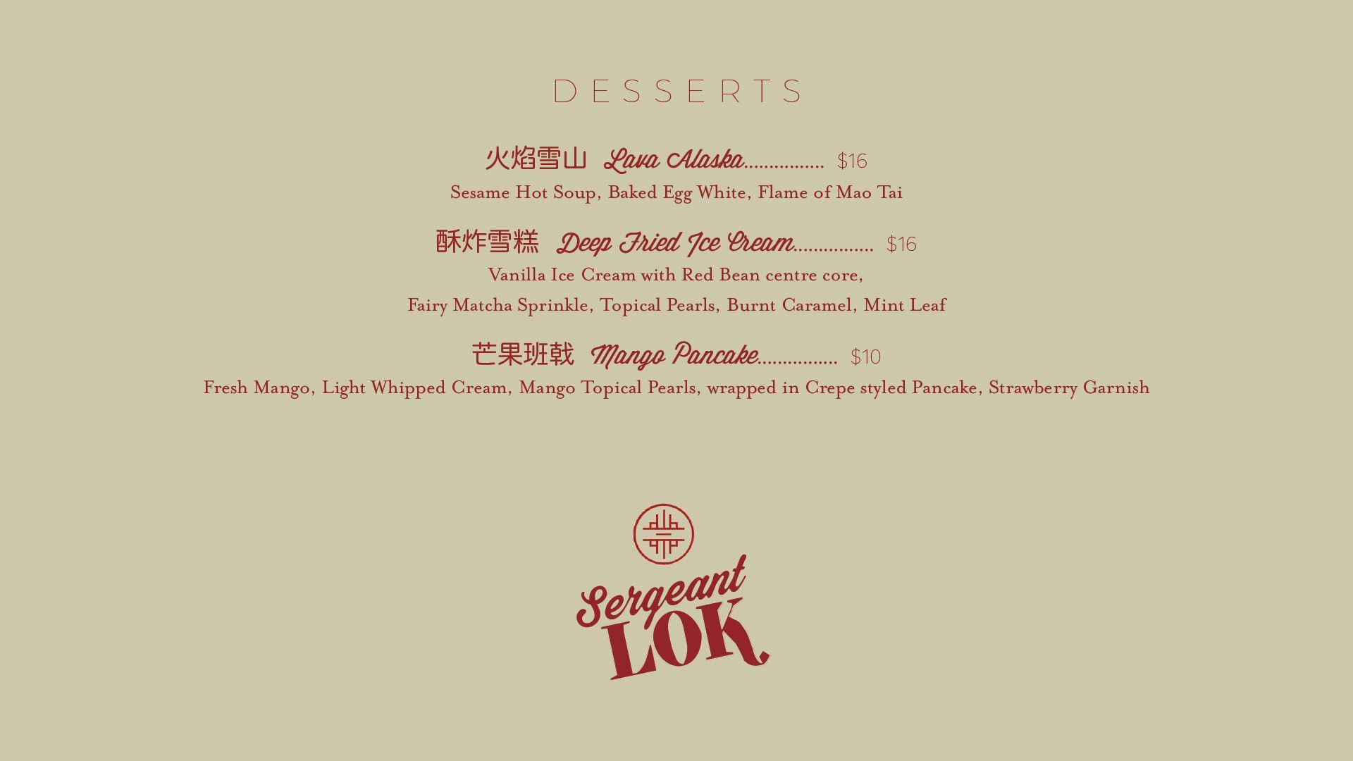
The Sergeant Lok menu design is refined and elegant; the identity is uncomplicated but dynamic, making it suitable for a variety of applications. There is a distinct nod to Chinese heritage.
Sergeant Lok branding design
Branding
Logo design
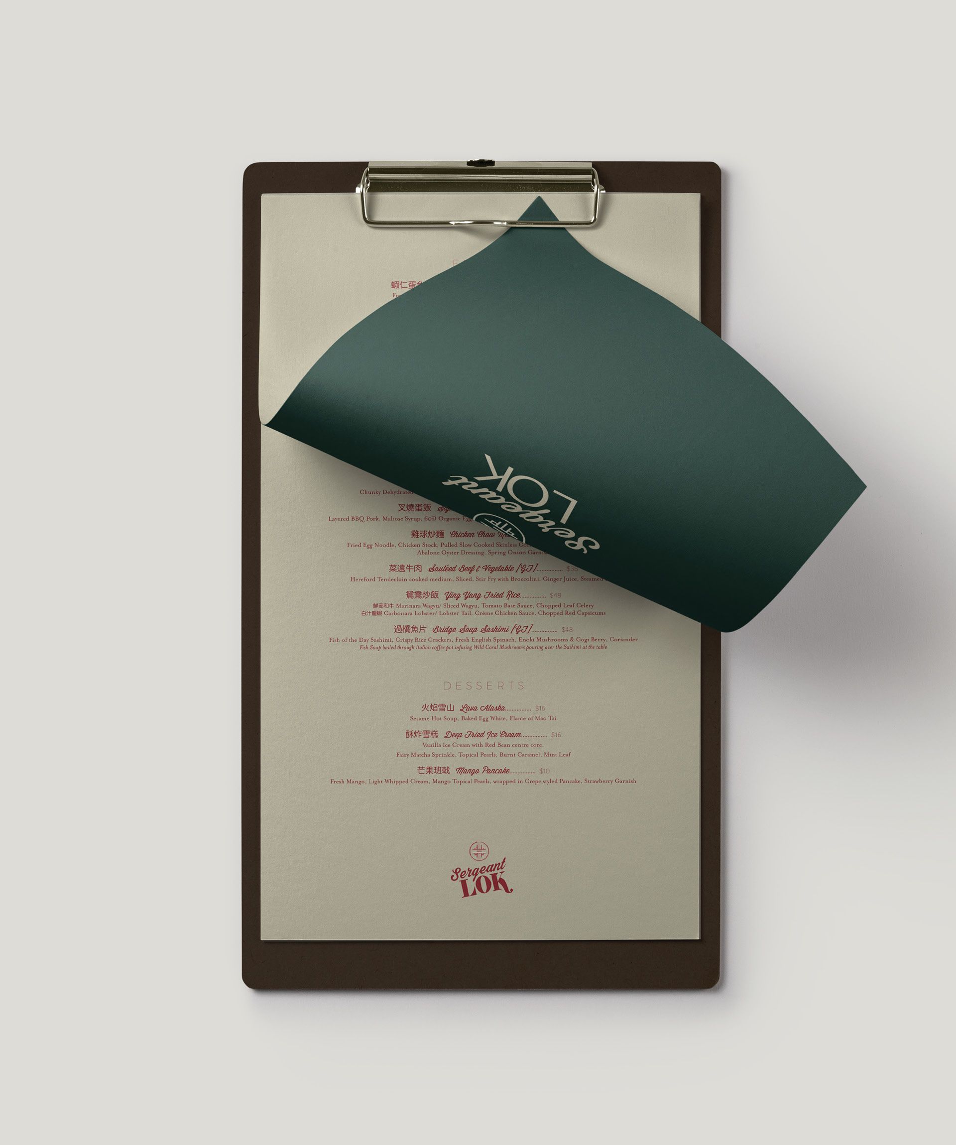
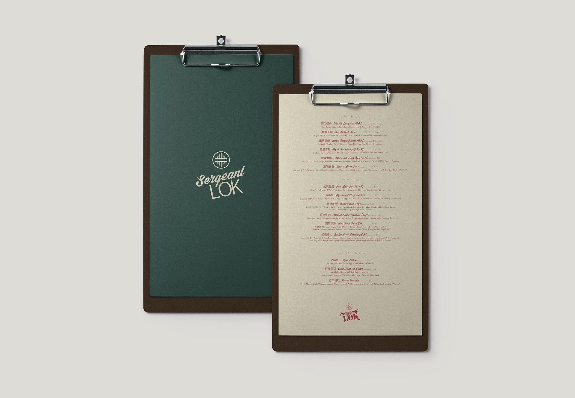
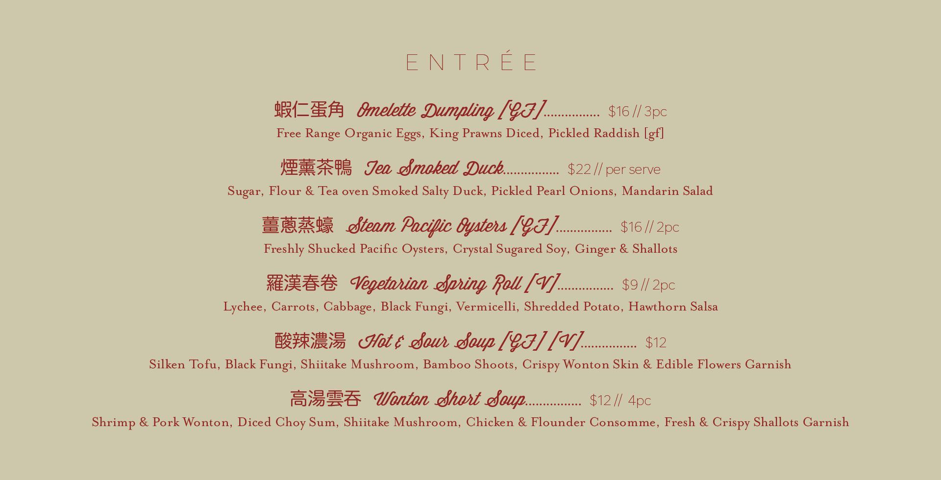
Menu design
Signage design
Art direction
about this project
There is a story.
The logo does not need to tell this story.
It merely hints and sets the scene.
It uses subtlety and nuance to do this.
It is an appetiser for what is to come.
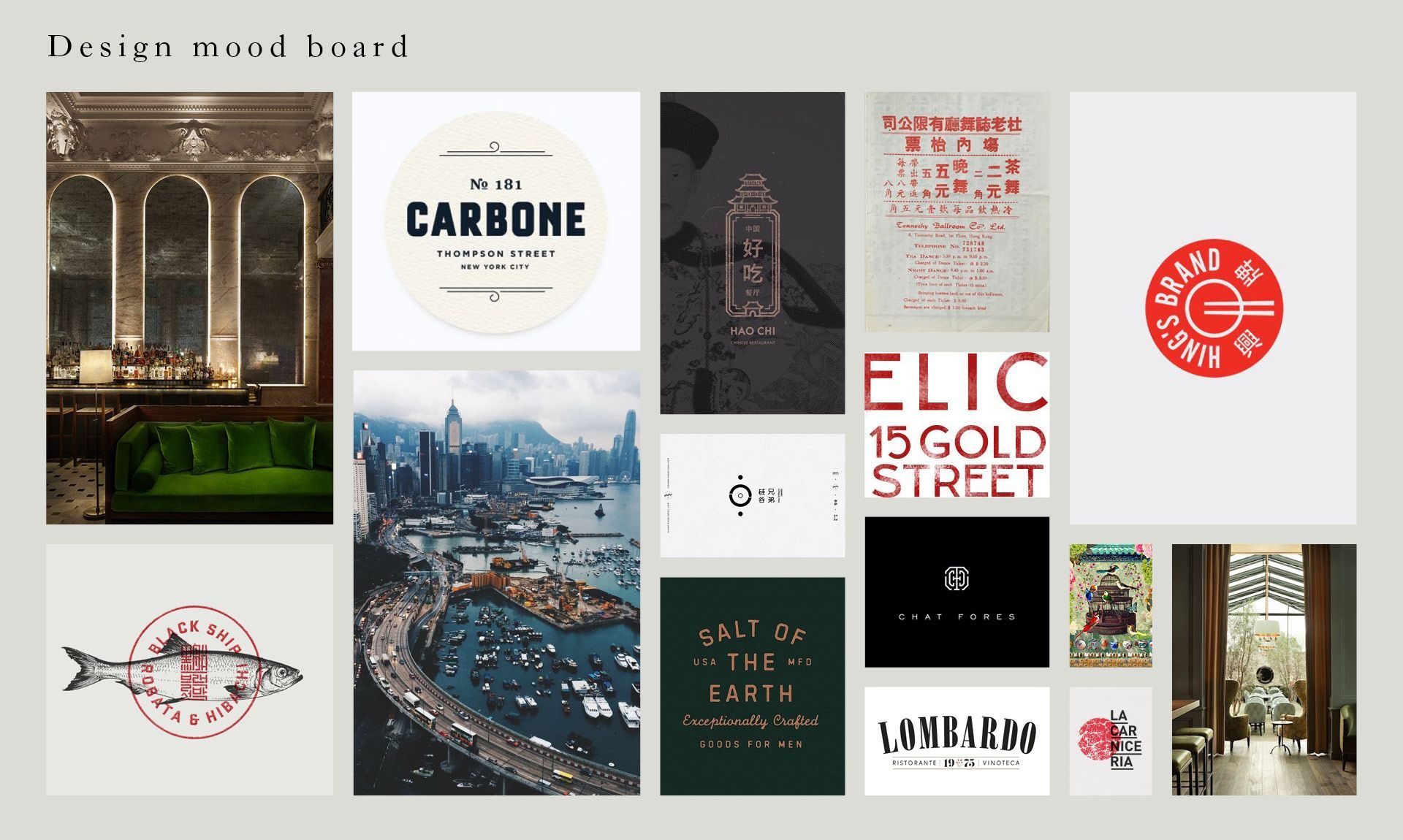
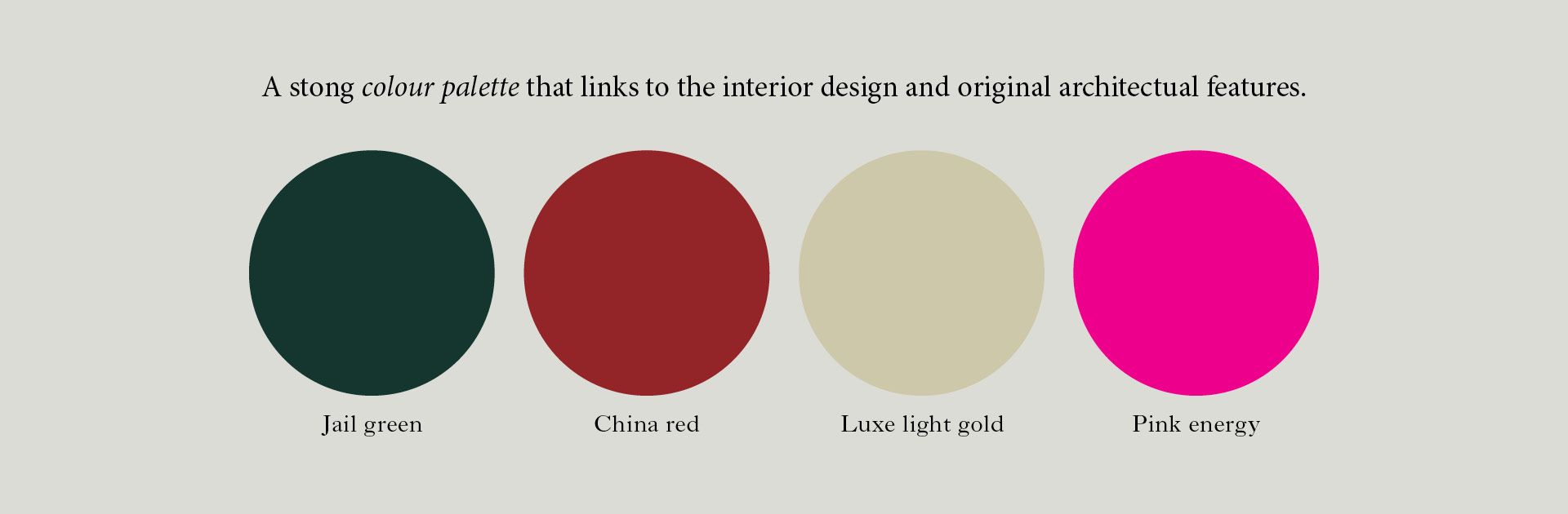
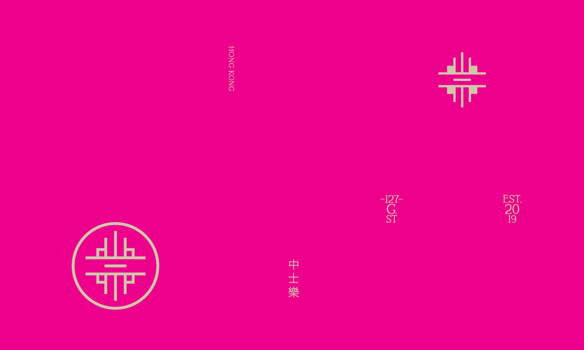
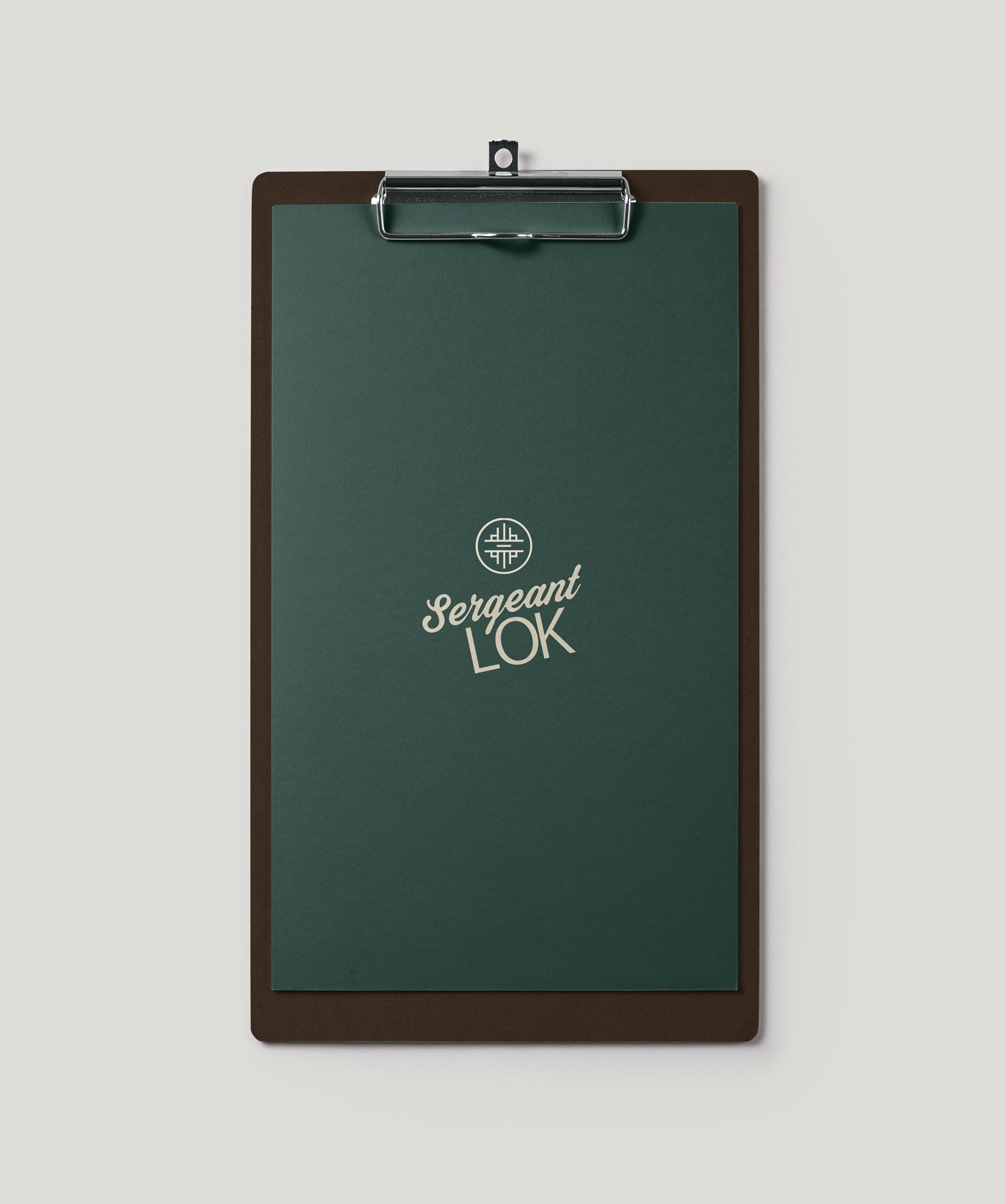
The logo mark for this branding design project is contemporary in appearance, however, it reveals clear references to traditional Chinese characters. The final design is clean but complex with a stamp of authority. The strong colour palette links to the new interior design and the original architectural features.


We’ve been helping businesses and companies express themselves for 20 years.
You can find us here...