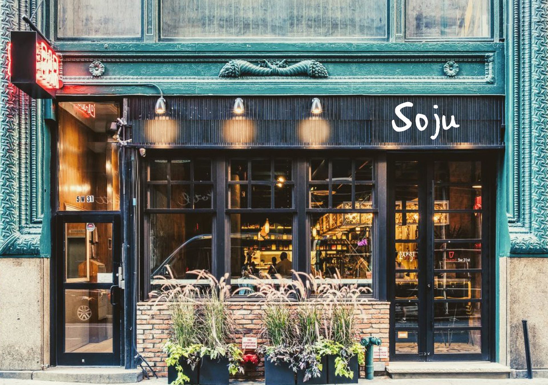
Soju celebrates the flavours of Korean cuisine and borrows from the depth of Korean culture. The playful logo typeface has textured edges and weight variation. This, coupled with the inconsistent spacing, breathes personality into the typography. It almost has a drunken feel... and with K-bomb Shots and Soju-Coladas on the menu we may have ended up closer to the truth than we had bargained on!
Soju branding & menu design
Branding
Typography
Logo design
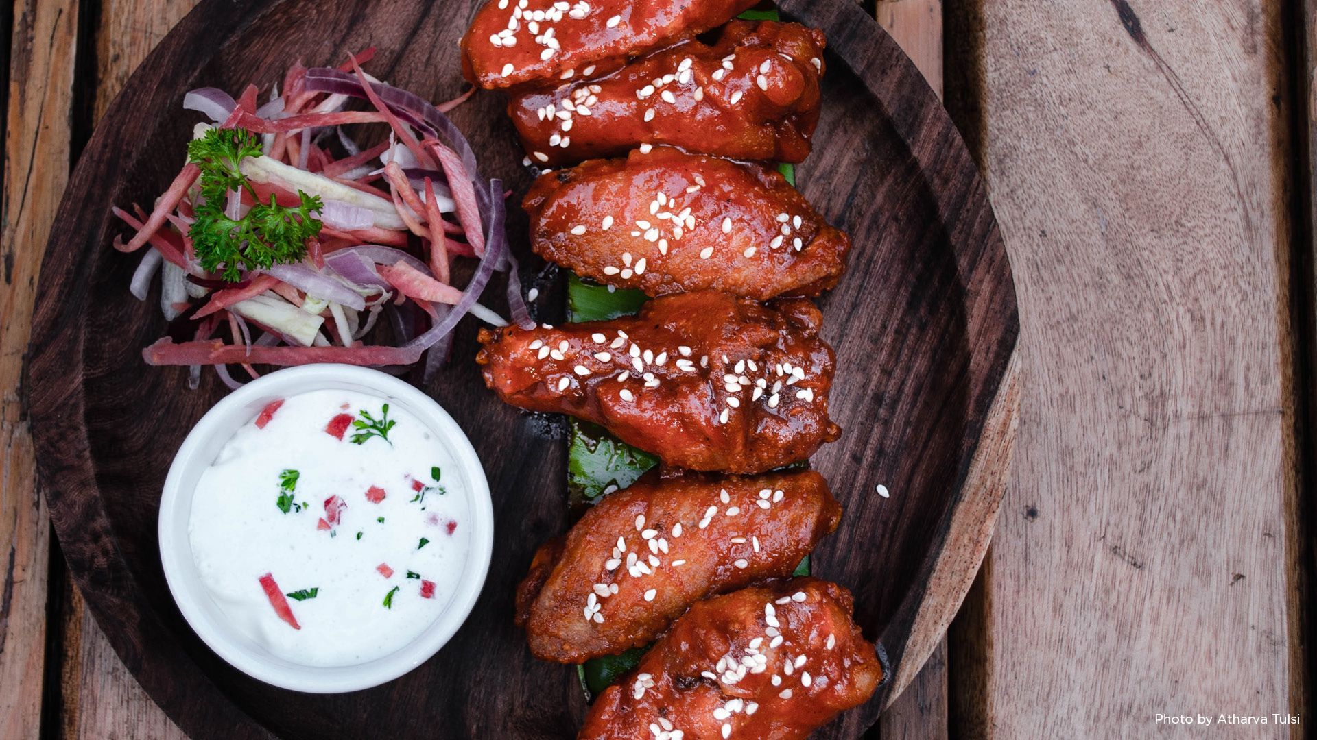
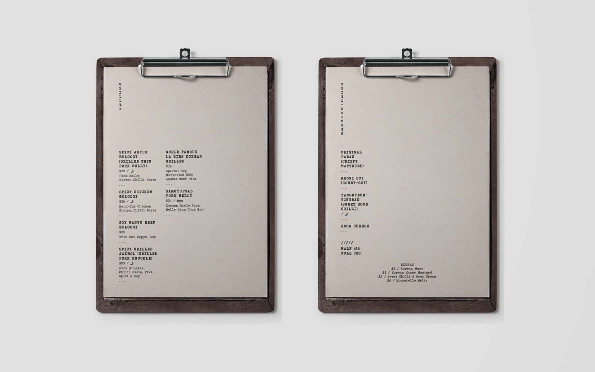
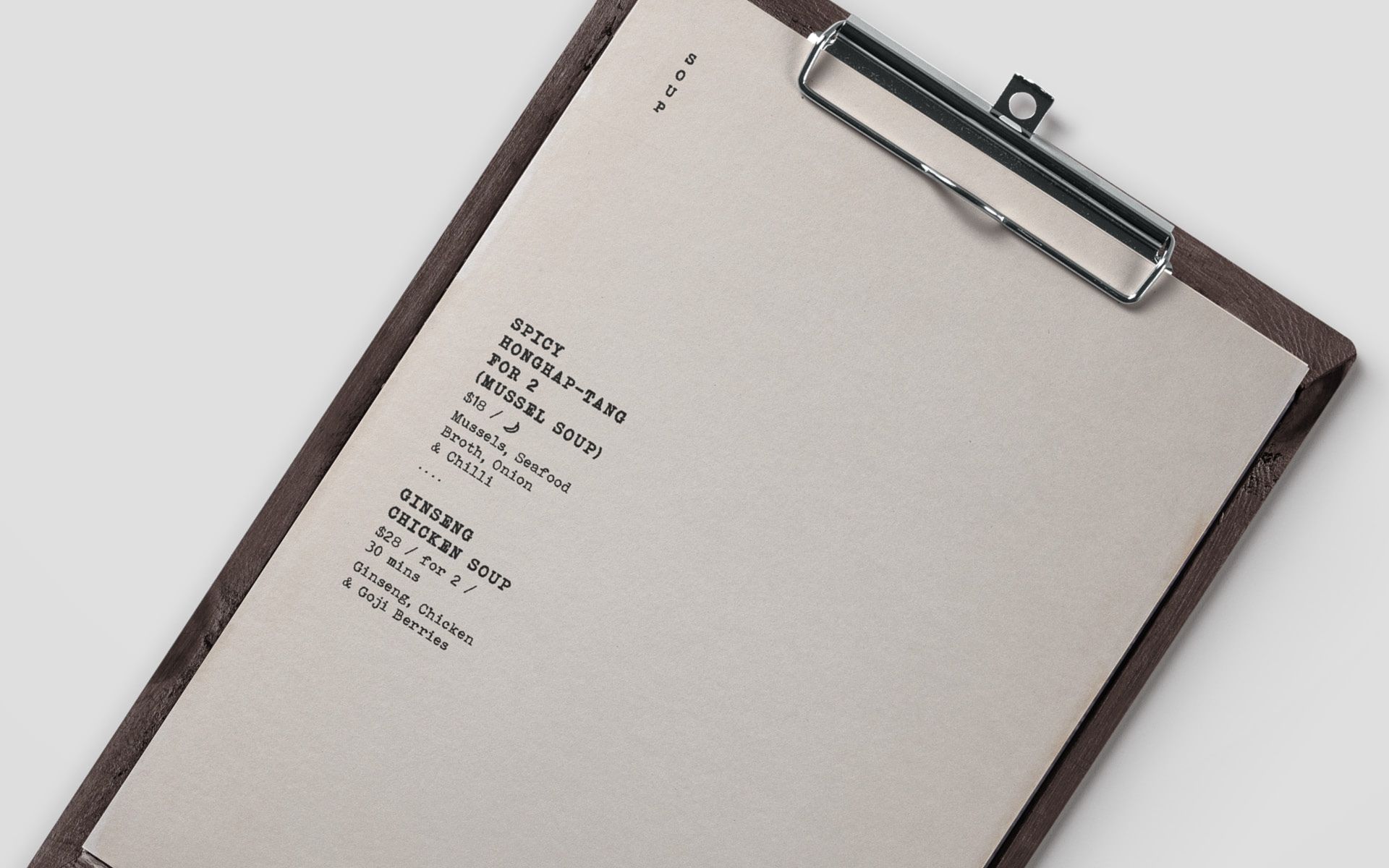
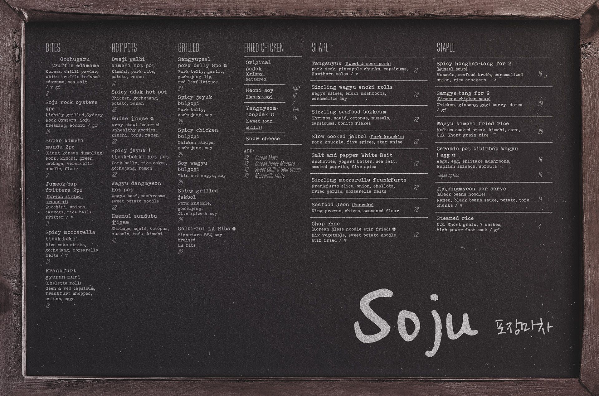
Menu design
Art direction
about this project
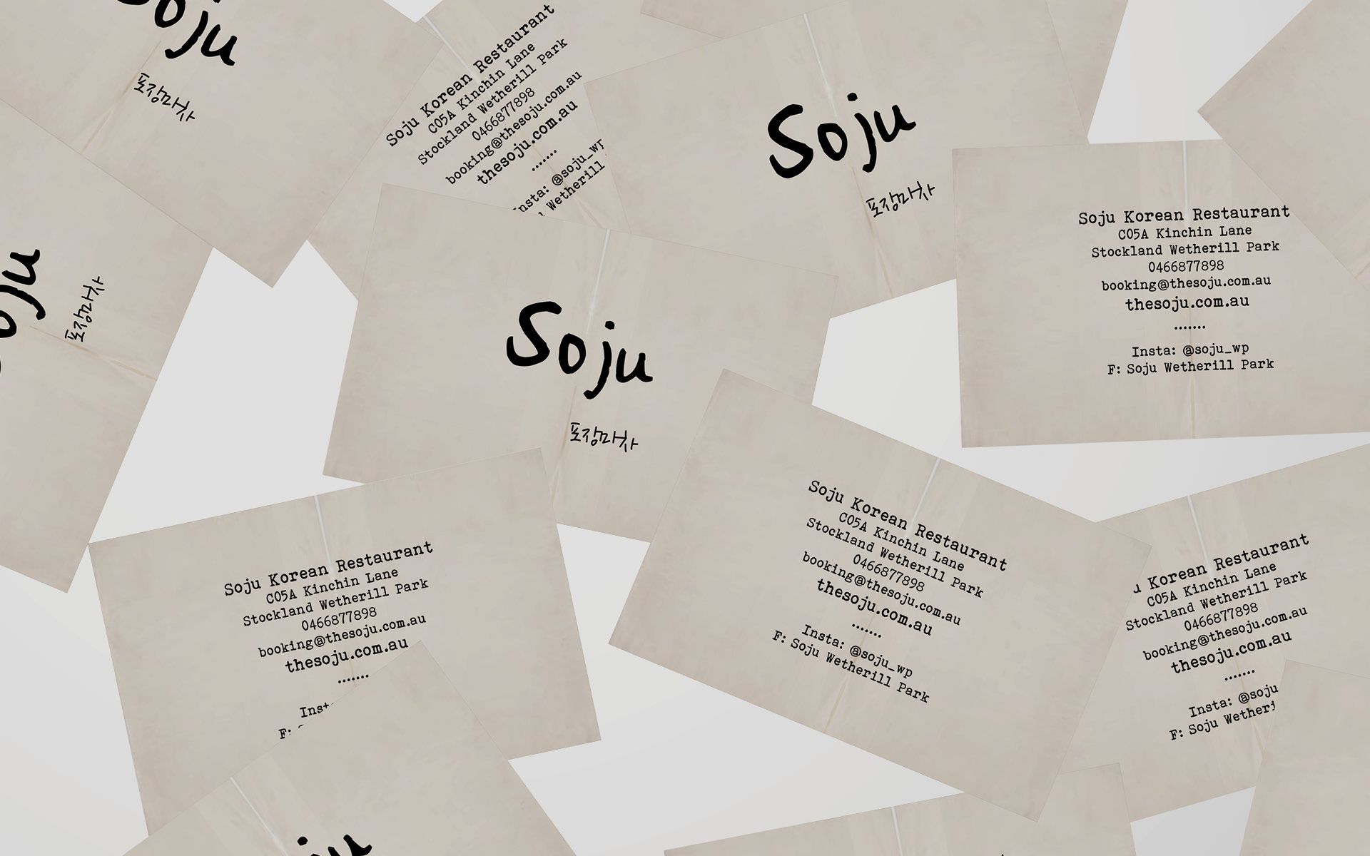
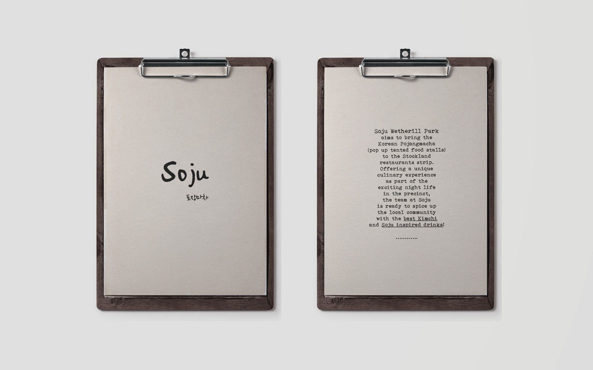
The logo type is used to define the brand independently or combined with the secondary (Korean) type. The logo type may be used only as one colour contrasting to the background or less contrasting for a more subtle application. The colour chosen is always dictated by the environment and the usage.


We’ve been helping businesses and companies express themselves for 20 years.
You can find us here...