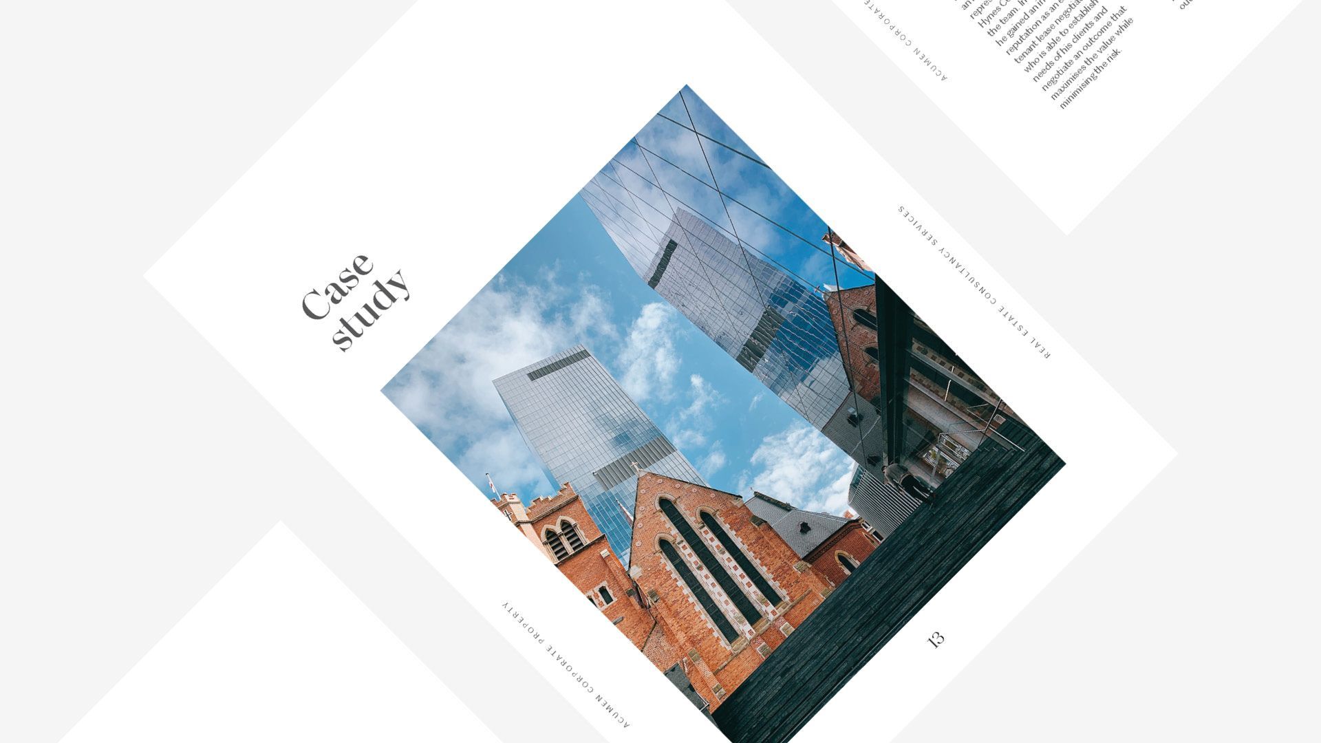
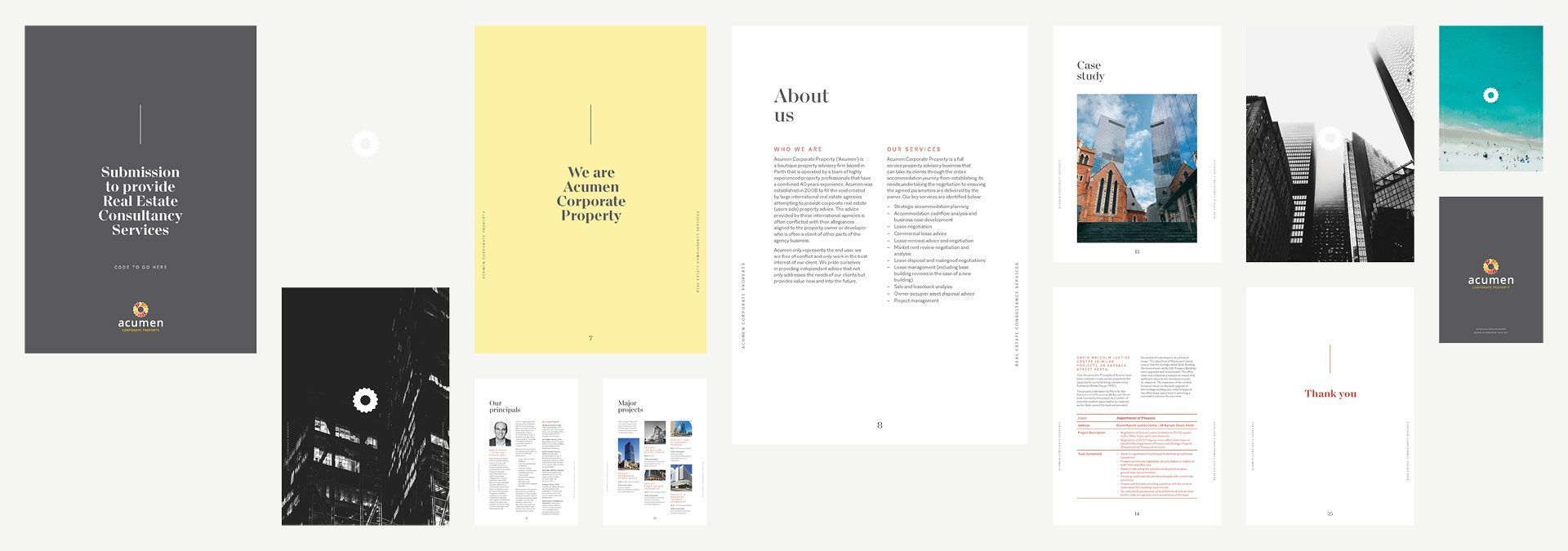
White space contrasts with and balances full-page images of corporate real estate and aspirational location shots, resulting in an elegantly minimalist, easy-to-read document. We chose a dynamic font (superfamily Macklin) that boasts complementary serif and sans serif styles. It was designed by Malou Verlomme of the Monotype Studio.
Acumen Corporate Property proposal design
Branding
Typography
Editorial design
Art direction
Report design
Tender/proposal design
about this project
Acumen Corporate Property is a specialist consultancy firm focusing on corporate real estate, with an emphasis on providing independent commercial tenant advisory and occupational representation services. Our design approach to this 30+ page document was to be as refined with design as Acumen is careful with their work.