Beneduce Vineyards: a story through playful packaging design
The history of wine bottle label design goes back hundreds of years, if not more. In recent years there has been a significant shift in the approach of some wine label designers to their concepts. I was instantly drawn to Beneduce wines because of their label. I really love the thoughtful design and the way it captures the spirit of Italian culture through simple illustrations.
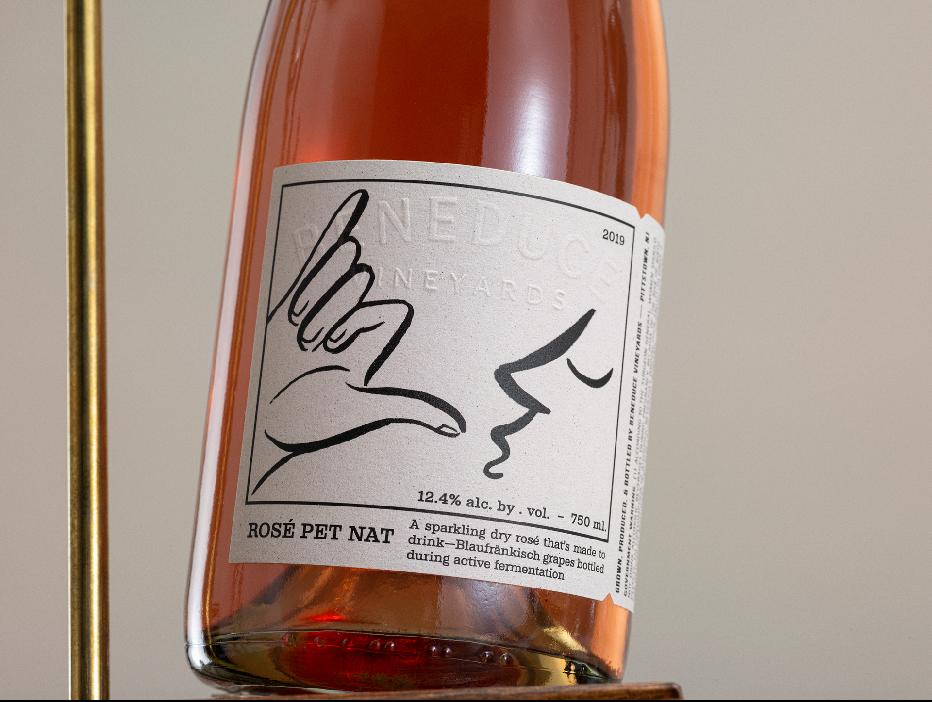
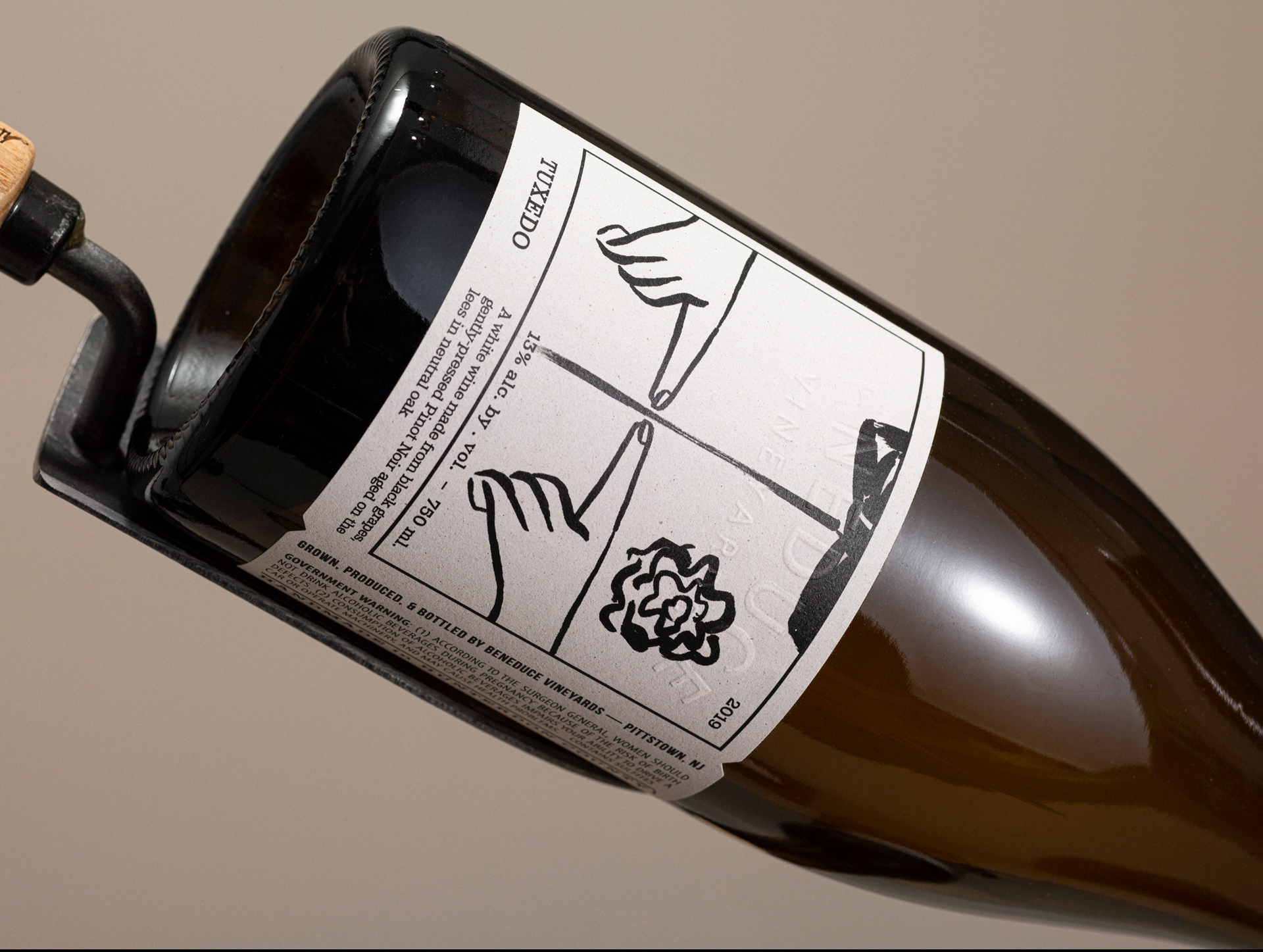
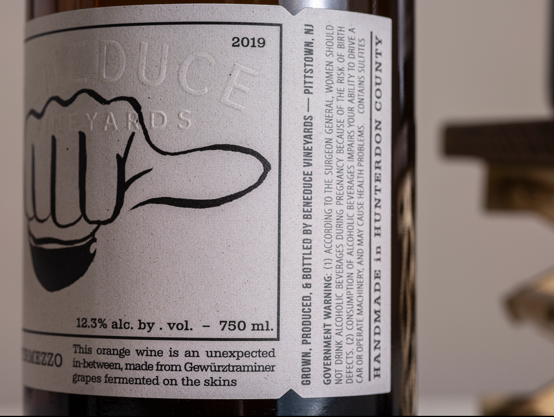
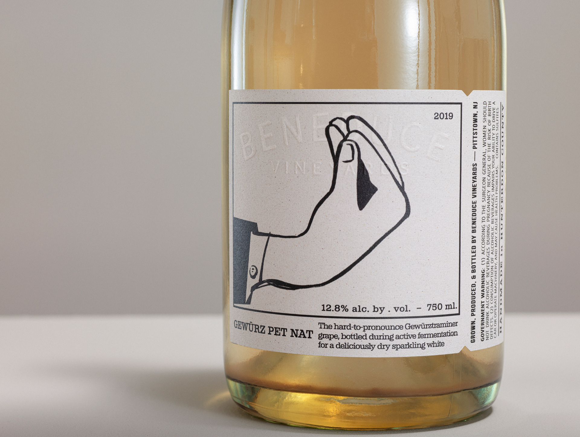
Beneduce wine labels are more than just eye-catching, they tell a story. The illustrations, with their nod to classic Italian hand gestures, add a playful and welcoming touch. It’s as if the bottle is inviting you to experience a little piece of Italy. I find this approach to design incredibly refreshing compared to the more conventional and classic wine label designs you often see on the shelves.
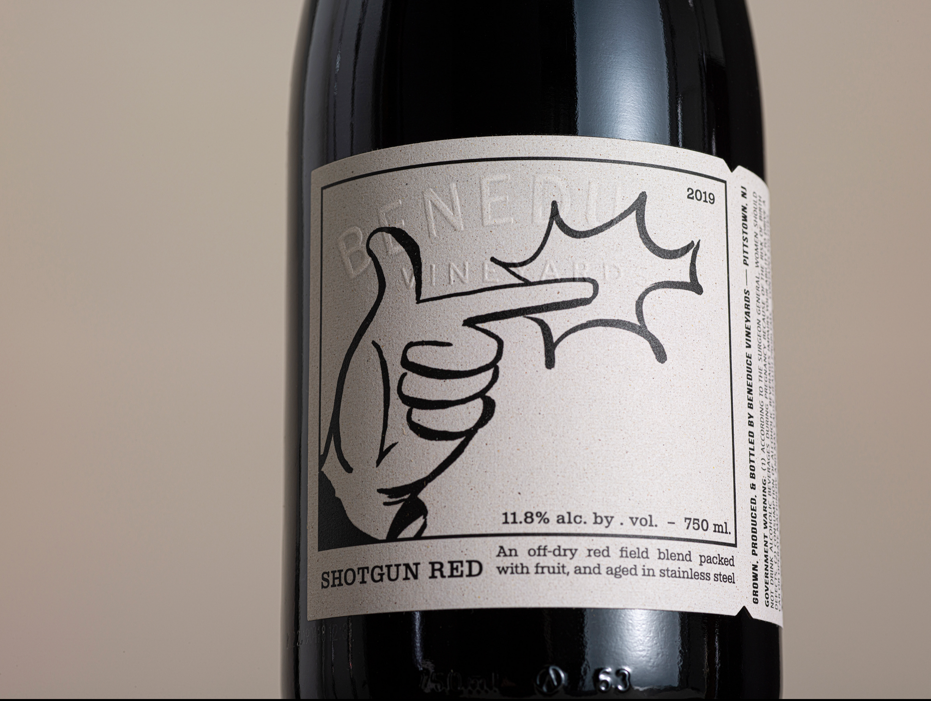
For me, the tactile experience is just as important as the visual one. The embossed texture of the paper; the clean, elegant lines of the artwork; and the carefully chosen fonts; all contribute to a feeling of quality and attention to detail.
I love how the packaging design balances tradition and modernity and how the labels honour the vineyard’s Italian heritage while incorporating contemporary graphic design elements.