Our favourite magazine designs: Monocle
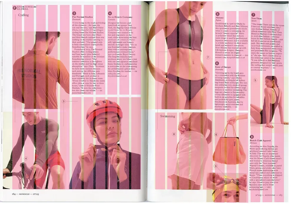
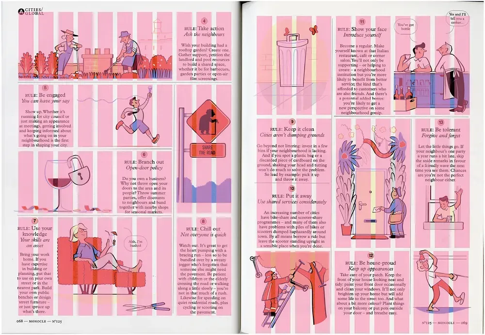
Monocle magazine has been in my editorial design inspiration board for perhaps 10 years and it still relevant. Its notorious agility around the grid, type selection, little graphic devices that sprinkle the page, intricated column system and how they’ve brought editorial illustration back to life is fascinating.
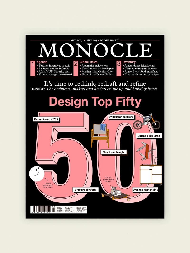
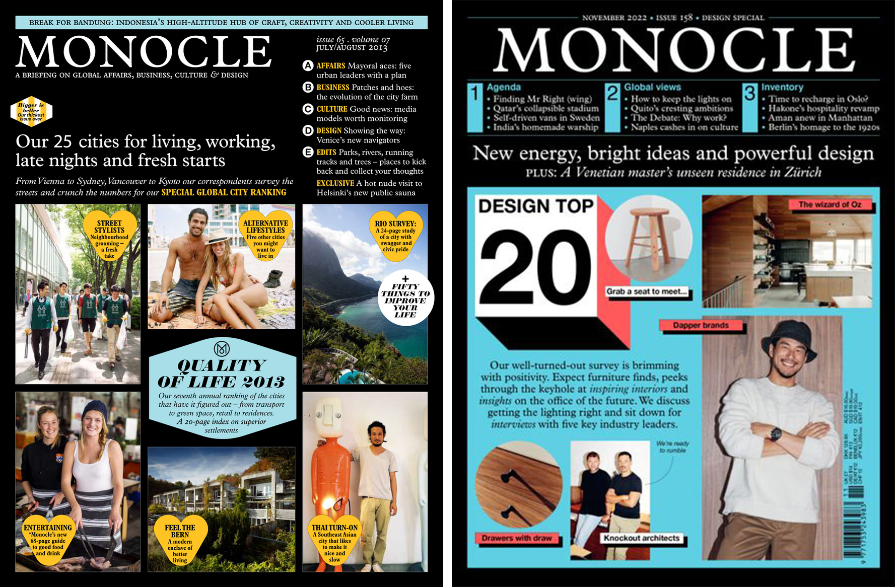
More often than not, as a magazine designer, I spend a lot of time just trying to decipher each magazine spread and how everything comes together like a very organised puzzle. Not only they are a nice read, but they read nicely also.
Source
monocle.com
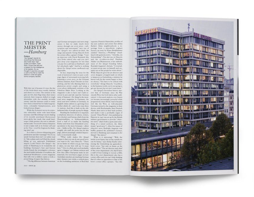
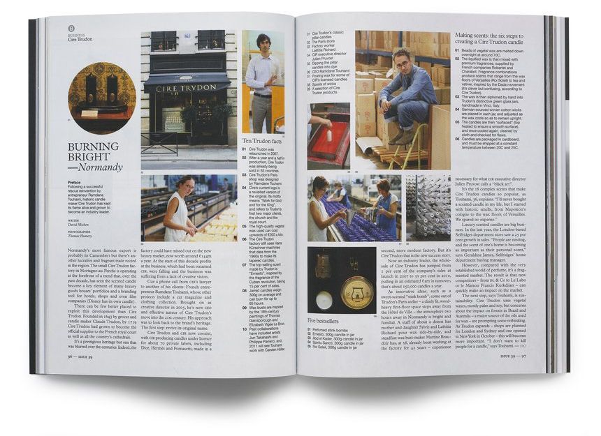
A few years ago they’ve had a very humbling approach to improving the design of their layout, font size and grid. They increased font size and reduced the amount of columns and small lockups, making everything bigger, wider and more accessible, the reason being “we are not turning any younger”. For a long time I thought about this courageous move and how we, graphic designers, should listen carefully to our target audience.
We’ve been helping businesses and companies express themselves for 20 years.
You can find us here...