Riposte Magazine: Bold design that elevates every story
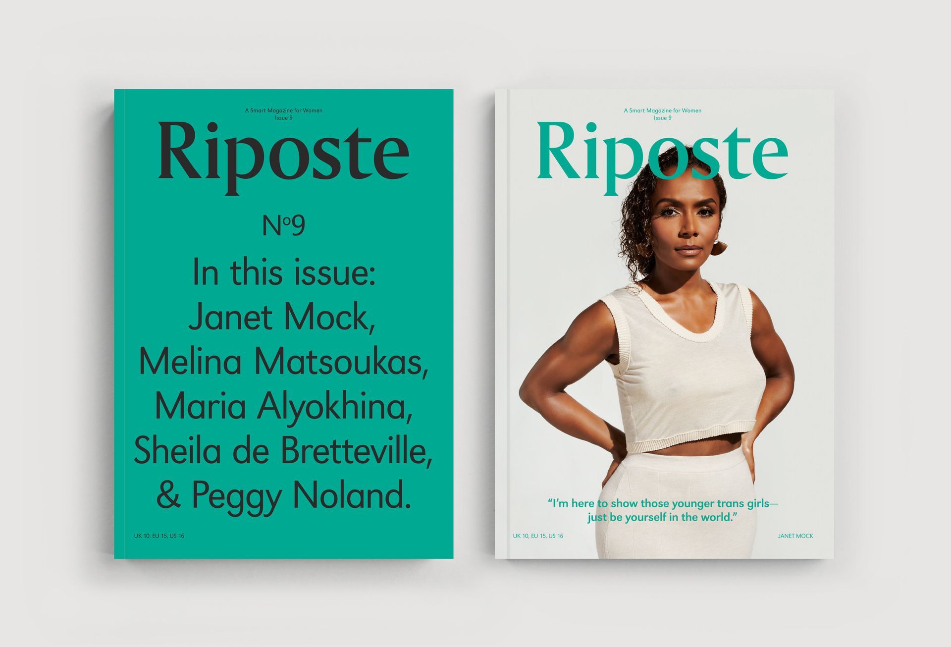
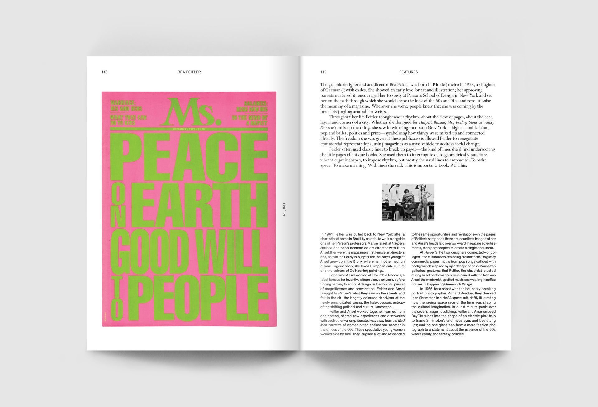
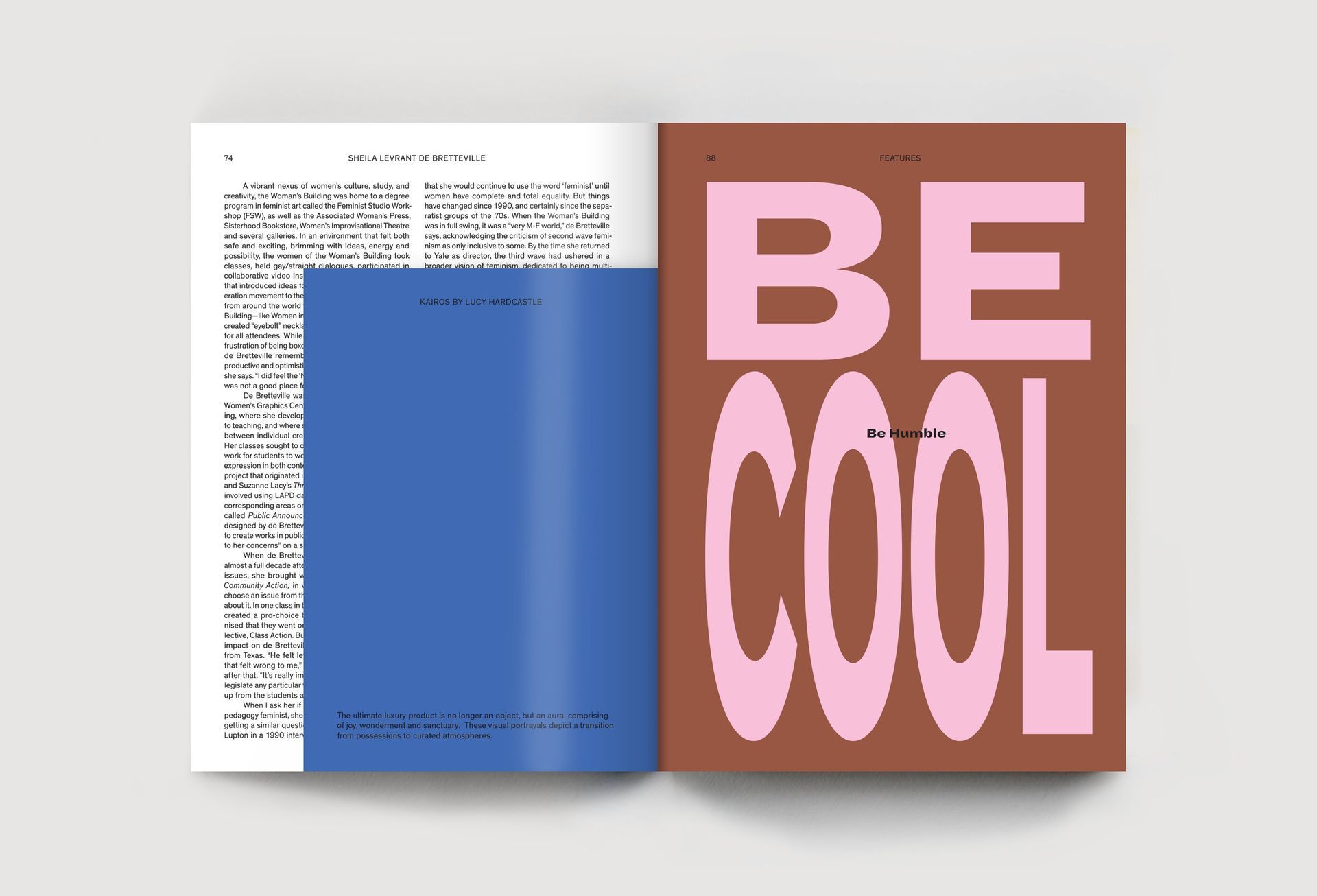
Riposte Magazine stands out visually with its bold design. The magazine often uses striking and vibrant colour blocks, clean typography, and dynamic layouts, capturing attention from the first glance. Each issue is defined by a seamless blend of sans-serif fonts with serif styles, paired with powerful photography that stands out.
Riposte Magazine is a great example of thoughtful design where bold aesthetics meet insightful content. Every issue feels like a carefully curated experience, where the magazine designer’s choices are an integral part of how the stories and interviews connect with the reader. What I like the most is how the magazine creates a balance between being visually daring and accessible, allowing the design to draw you in without becoming overwhelming. For me, as a magazine designer, it’s this harmony between substance and style that makes it a standout in the world of independent magazines.
See it on www.ripostemagazine.com/homepage/issue-9
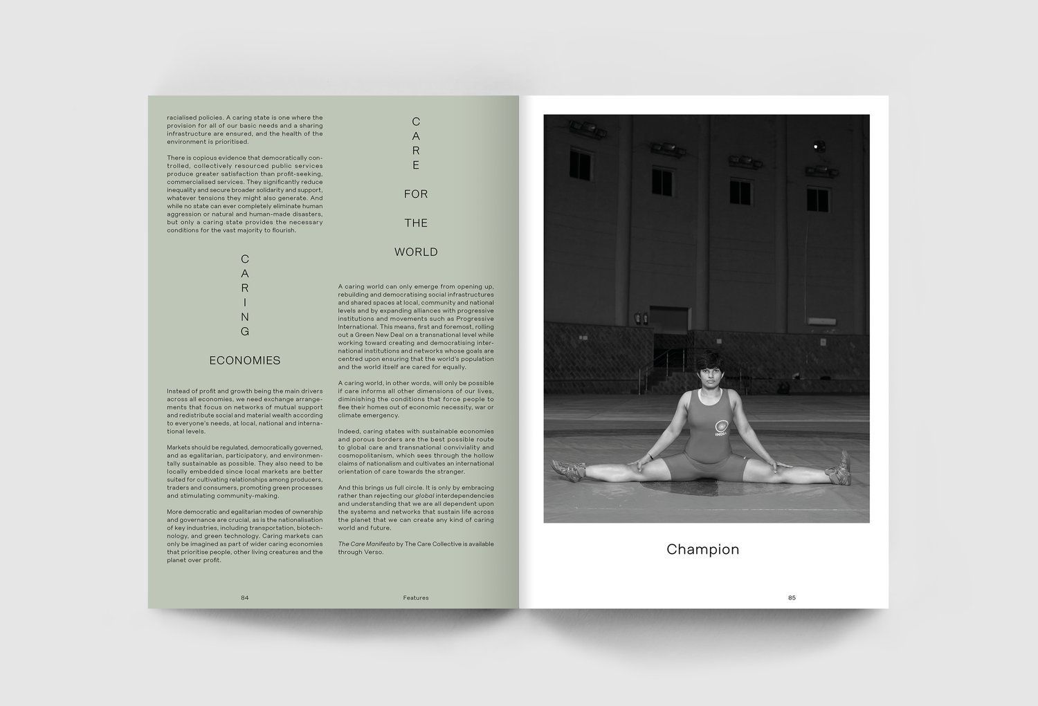
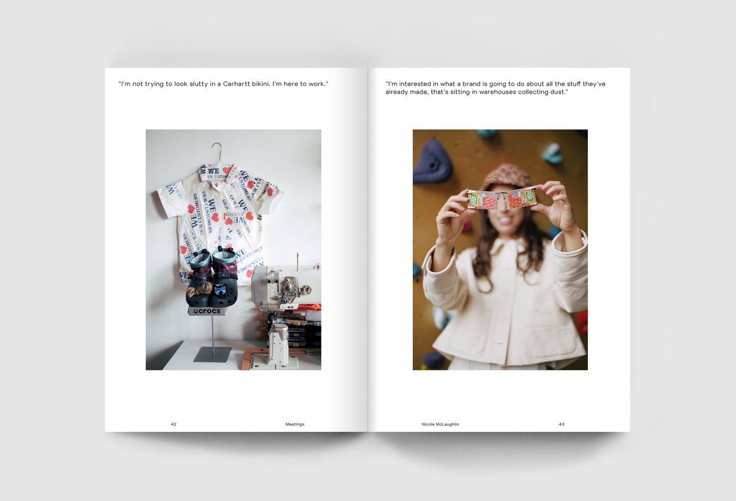
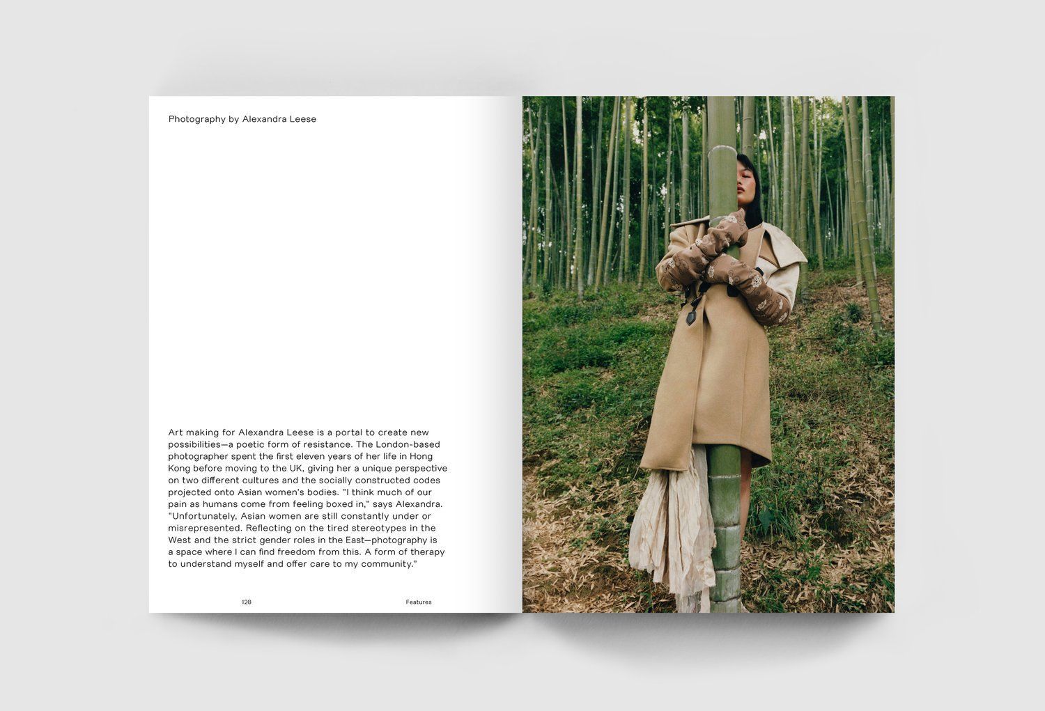
Photography and illustration also plays a big role on its visual style. The images are bright and playful, with photos capturing real and candid moments that feel personal. The illustrations vary in style, from bold lines to more detailed artwork, giving each issue a fresh feel. This mix of visuals keeps the content interesting and visually appealing.
Sometimes, the magazine design uses full-bleed imagery, with photos or artwork taking over entire spreads for a more immersive experience. Sometimes, content is left with minimal text, letting the visuals make a stronger impact.
Format-wise, Riposte uses a clean, grid-based magazine layout, with plenty of white space, letting the content stand out. Icons and visual markers are minimal but effective, creating a good balance between images, text, and space.
Overall, Riposte Magazine shows how an effective design can enhance storytelling. Its bold visuals and engaging content create a reading experience that is both inspiring and enjoyable. Riposte is a great example of how design can transform a magazine design into something memorable and impactful.