Belair Cantina menu design: a visual fiesta
As a graphic designer, I find the Belair Cantina menu a great example of how thoughtful design can elevate a dining experience. The moment I saw the menu, I was captivated by its vibrant and engaging aesthetic.
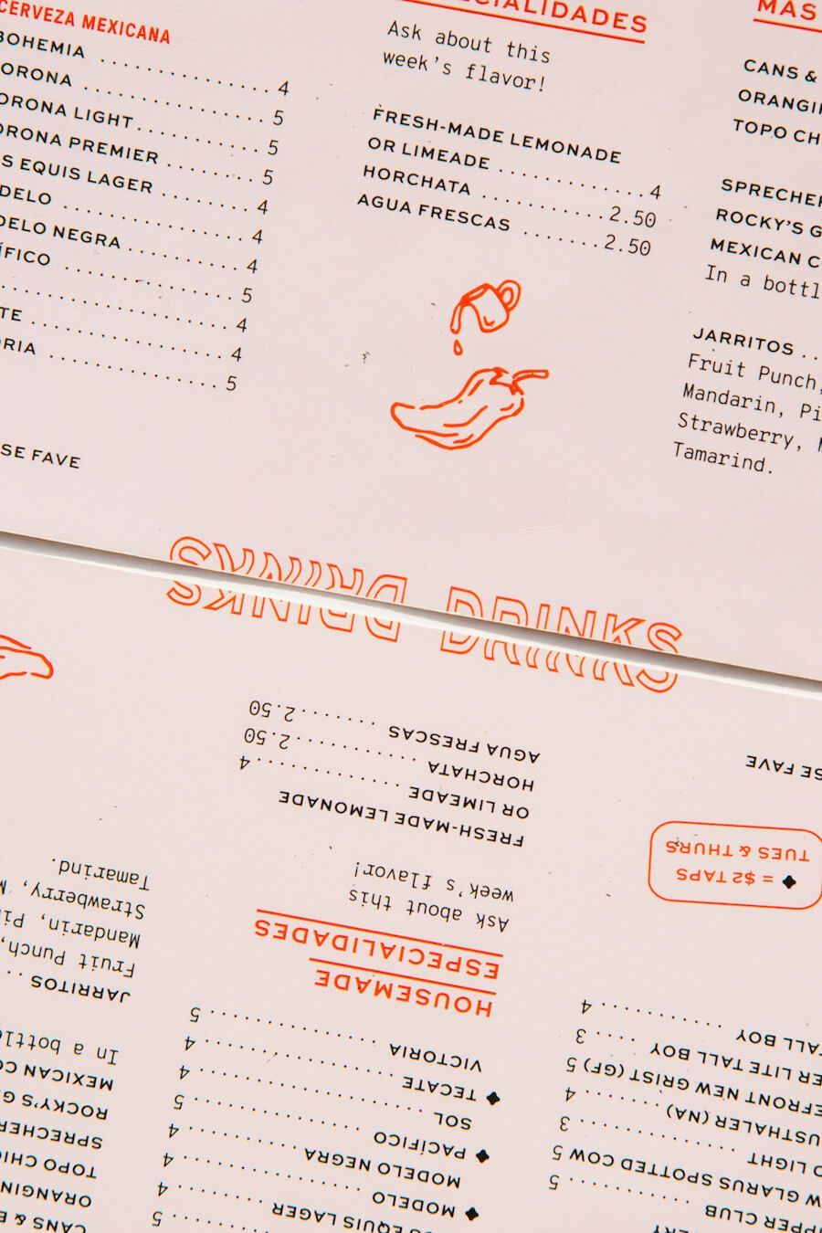
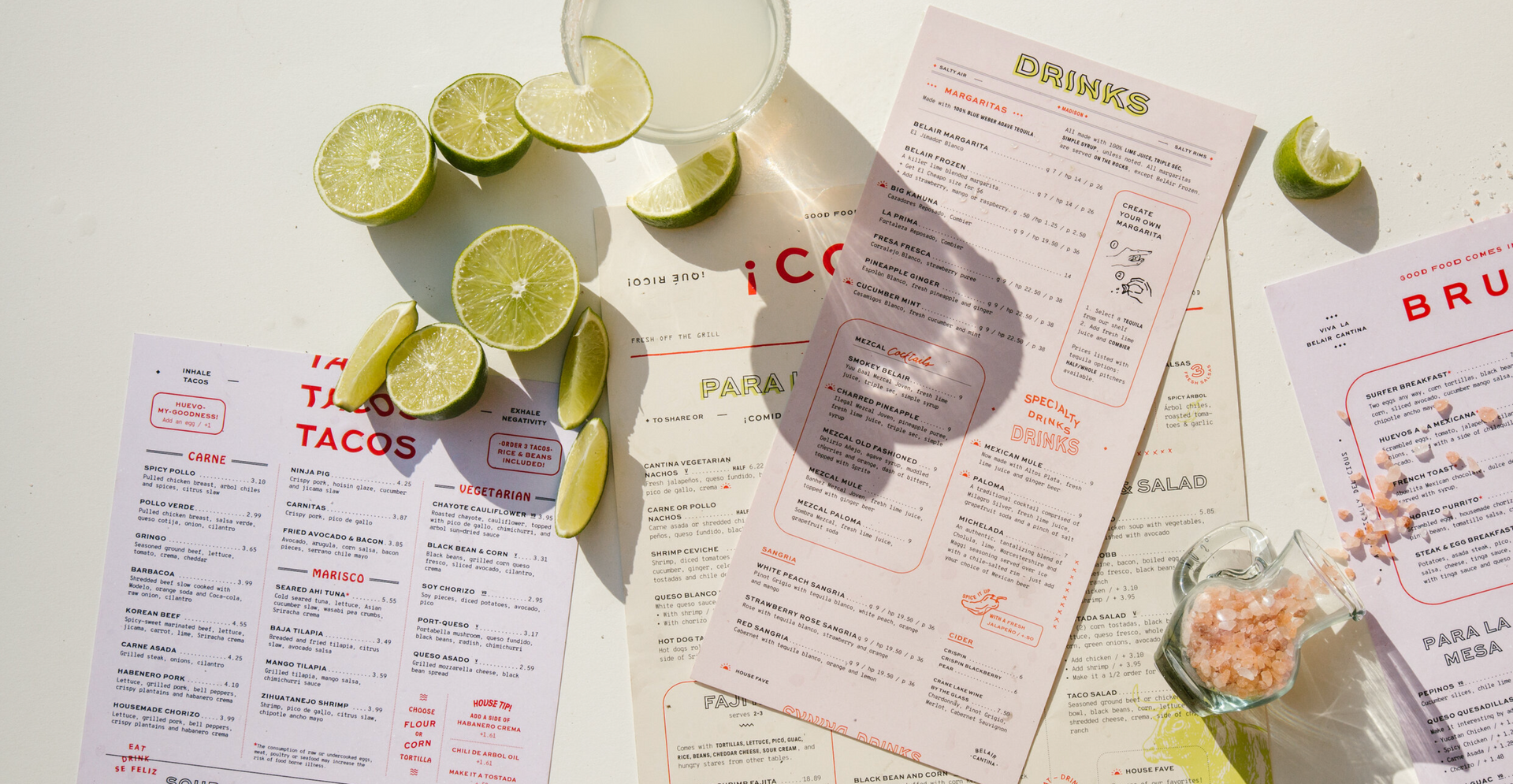
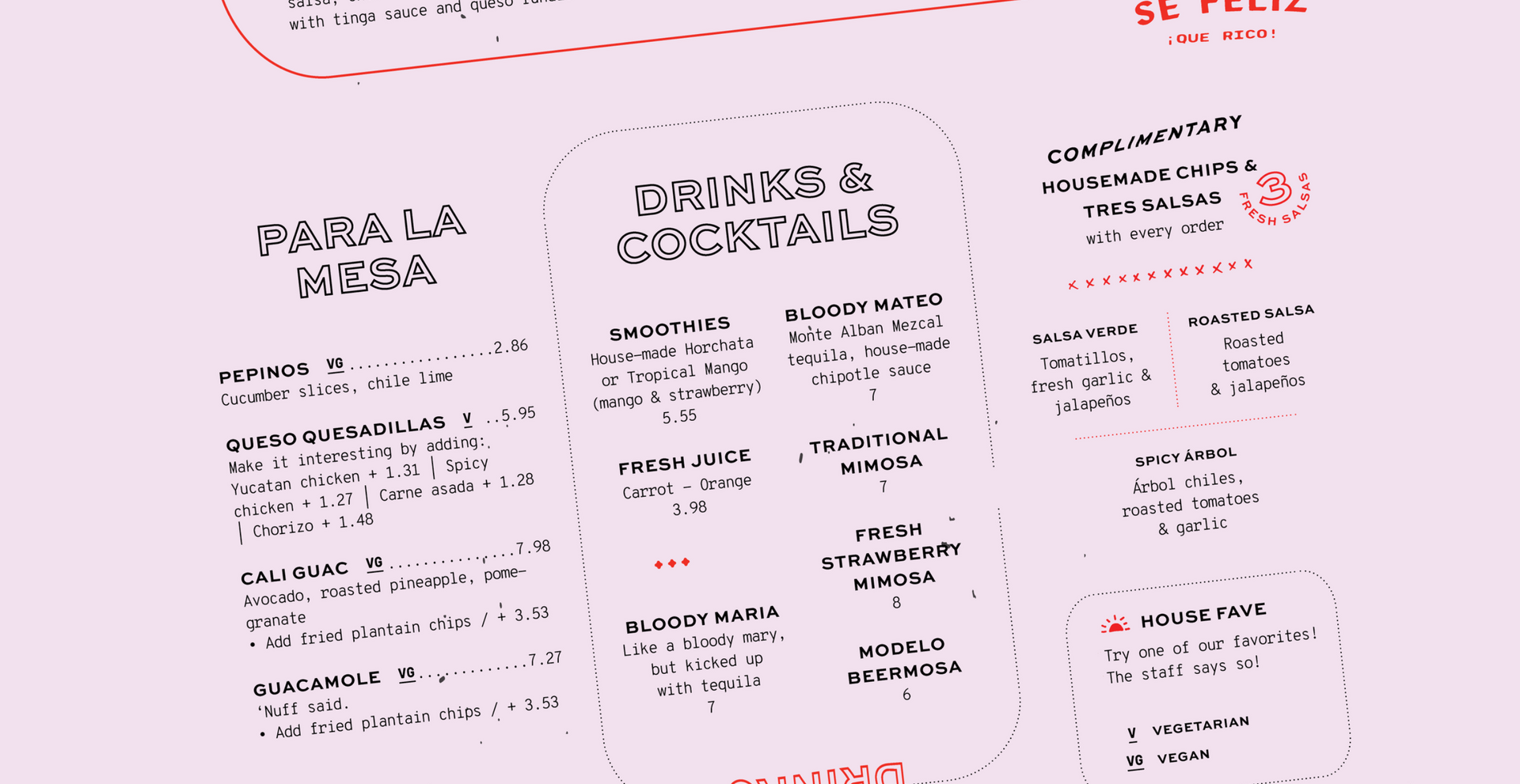
The use of bright and bold colours like red, yellow, and pink, evokes the lively spirit of the Mexican culture and draws the eye instantly. Each colour serves a specific purpose, creating distinct identities for the different menus.
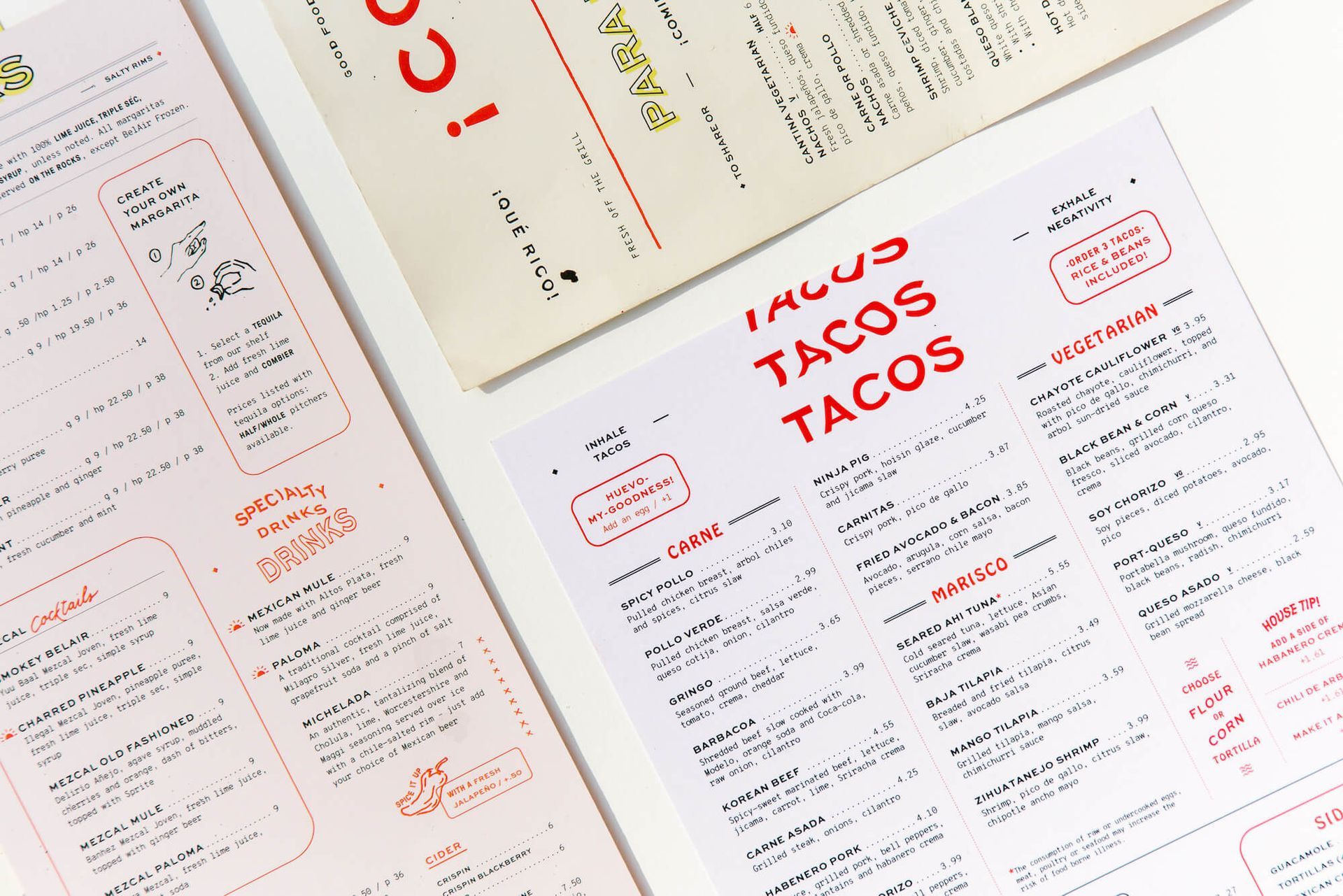
What truly sets the Belair Cantina menu design apart for me are the illustrations scattered throughout the design. These hand-drawn elements add a personal touch, capturing the atmosphere of the restaurant. From tacos and margaritas to playful drawings of ingredients, these illustrations transform the menu design from a simple list of options into a vibrant narrative.
The layout of the menu is organized using lines and boxes to separate different sections. This design choice ensures that despite the abundance of visual elements, the menu remains clean and easy to read.
See it on
www.meiwensee.com/design/bel-air-cantina
As a menu designer, what I love most about the Belair Cantina menu design is how it manages to feel both professional and personal. The combination of vibrant colours, playful typography, and illustrations creates a welcoming and friendly vibe that makes diners feel at home.